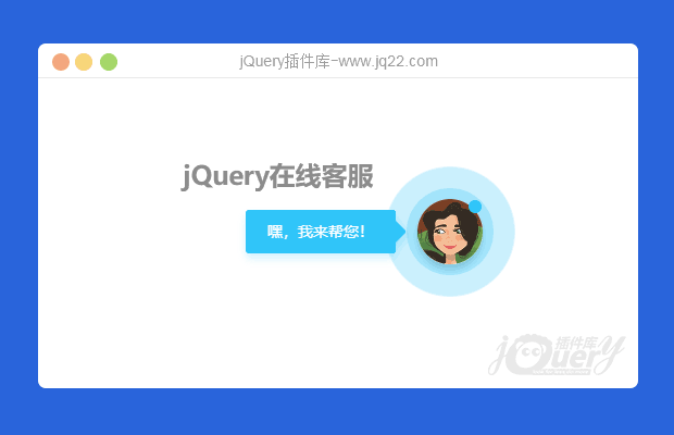
如本站右下角的演示,是从jq22拿过用来的,但是源码不完整,而且有很多缺陷,现在完善修复一下,放出来给大家
html代码,请自行修改头像链接:
 嘿,我来帮您!
附上js代码
上面部分是判断是否手机移动端,下面是判断后,针对移动设备点击后跳转到相对应的客服链接
样式代码:
@keyframes scaleToggleOne { 0 {
transform:scale(1);
-webkit-transform:scale(1)
}
50% {
transform:scale(2);
-webkit-transform:scale(2)
}
100% {
transform:scale(1);
-webkit-transform:scale(1)
}
}
@keyframes scaleToggleTwo { 0 {
transform:scale(1);
-webkit-transform:scale(1)
}
20% {
transform:scale(1);
-webkit-transform:scale(1)
}
60% {
transform:scale(2);
-webkit-transform:scale(2)
}
100% {
transform:scale(1);
-webkit-transform:scale(1)
}
}
@keyframes scaleToggleThree { 0 {
transform:scale(1);
-webkit-transform:scale(1)
}
33% {
transform:scale(1);
-webkit-transform:scale(1)
}
66% {
transform:scale(2);
-webkit-transform:scale(2)
}
100% {
transform:scale(1);
-webkit-transform:scale(1)
}
}
.animated { -webkit-animation-duration: .5s; animation-duration: .5s; -webkit-animation-fill-mode: both; animation-fill-mode: both }
.livechat-girl { width: 60px; height: 60px; border-radius: 50%; position: fixed; bottom: 5px; right: 40px; opacity: 0; -webkit-box-shadow: 0 5px 10px 0 rgba(35,50,56,.3); box-shadow: 0 5px 10px 0 rgba(35,50,56,.3); z-index: 700; transform: translateY(0); -webkit-transform: translateY(0); -ms-transform: translateY(0); cursor: pointer; -webkit-transition: all 1s cubic-bezier(.86, 0, .07, 1); transition: all 1s cubic-bezier(.86, 0, .07, 1) }
.livechat-girl:focus { outline: 0 }
.livechat-girl.animated { opacity: 1; transform: translateY(-40px); -webkit-transform: translateY(-40px); -ms-transform: translateY(-40px) }
.livechat-girl:after { content: ''; width: 12px; height: 12px; border-radius: 50%; background-image: linear-gradient(to bottom, #26c7fc, #26c7fc); position: absolute; right: 1px; top: 1px; z-index: 50 }
.livechat-girl .girl { position: absolute; top: 0; left: 0; width: 100%; height: auto; z-index: 50;border-radius: 50%; }
.livechat-girl .animated-circles .circle { background: rgba(38,199,252,.25); width: 60px; height: 60px; border-radius: 50%; position: absolute; z-index: 49; transform: scale(1); -webkit-transform: scale(1) }
.livechat-girl .animated-circles.animated .c-1 { animation: 2s scaleToggleOne cubic-bezier(.25, .46, .45, .94) forwards }
.livechat-girl .animated-circles.animated .c-2 { animation: 2.5s scaleToggleTwo cubic-bezier(.25, .46, .45, .94) forwards }
.livechat-girl .animated-circles.animated .c-3 { animation: 3s scaleToggleThree cubic-bezier(.25, .46, .45, .94) forwards }
.livechat-girl.animation-stopped .circle { opacity: 0!important }
.livechat-girl.animation-stopped .circle { opacity: 0!important }
.livechat-girl .livechat-hint { position: absolute; right: 40px; top: 50%; margin-top: -20px; opacity: 0; z-index: 0; -webkit-transition: all .3s cubic-bezier(.86, 0, .07, 1); transition: all .3s cubic-bezier(.86, 0, .07, 1) }
.livechat-girl .livechat-hint.show_hint { -webkit-transform: translateX(-40px); transform: translateX(-40px); opacity: 1 }
.livechat-girl .livechat-hint.hide_hint { opacity: 0; -webkit-transform: translateX(0); transform: translateX(0) }
.livechat-girl .livechat-hint.rd-notice-tooltip { max-width: 1296px!important }
.livechat-girl .livechat-hint.rd-notice-tooltip .rd-notice-content { width: auto; overflow: hidden; text-overflow: ellipsis }
@media only screen and (max-width:1599px) {
.livechat-girl .livechat-hint.rd-notice-tooltip { max-width: 1060px!important }
}
@media only screen and (max-width:1309px) {
.livechat-girl .livechat-hint.rd-notice-tooltip { max-width: 984px!important }
}
@media only screen and (max-width:1124px) {
.livechat-girl .livechat-hint.rd-notice-tooltip { max-width: 600px!important }
}
.rd-notice-tooltip { -webkit-box-shadow: 0 2px 2px rgba(0,0,0,.2); box-shadow: 0 2px 2px rgba(0,0,0,.2); font-size: 14px; border-radius: 3px; line-height: 1.25; position: absolute; z-index: 65; max-width: 350px; opacity: 1 }
.rd-notice-tooltip:after { position: absolute; display: block; content: ''; height: 20px; width: 20px; -webkit-box-shadow: none; box-shadow: none; -webkit-transform: rotate(-45deg); -moz-transform: rotate(-45deg); -ms-transform: rotate(-45deg); -o-transform: rotate(-45deg); transform: rotate(-45deg); -webkit-border-radius: 3px; -moz-border-radius: 3px; border-radius: 3px; z-index: 50 }
.rd-notice-tooltip .rd-notice-content { background: 0; border-radius: 3px; width: 100%; color: #fff; position: relative; z-index: 60; padding: 20px; font-weight: 400; line-height: 1.45 }
.rd-notice-type-success { background-color: #26c7fc; -webkit-box-shadow: 0 5px 10px 0 rgba(38,199,252,.2); box-shadow: 0 5px 10px 0 rgba(38,199,252,.2) }
.rd-notice-type-success .rd-notice-content { background-color: #26c7fc }
.rd-notice-type-success:after { background-color: #26c7fc; -webkit-box-shadow: 0 5px 10px 0 rgba(38,199,252,.2); box-shadow: 0 5px 10px 0 rgba(38,199,252,.2) }
.rd-notice-position-left { margin-left: -20px }
.rd-notice-position-left:after { right: -6px; top: 50%; margin-top: -10px }
.rd-notice-tooltip.single-line .rd-notice-content { height: 40px; padding: 0 20px; line-height: 40px; white-space: nowrap }
把上面的代码放到相对应的位置就可以了,如果是使用自媒体博客Spimes主题的话
分别丢到代码框里面即可
!
发表评论